The front of Union Station, which was the official name of what we usually call Penn Station in Pittsburgh, was completely illuminated by winter sun the other day, so old Pa Pitt took the opportunity to pick out some of the multitude of terra-cotta decorations with a long lens.
The Liberty Avenue face of this building has been modernized and remodernized so many times that no one would take it for anything remarkably old. But it is actually one of the very few commercial buildings remaining downtown from the Civil War era. It was built in about 1865 for Arbuckle & Company, a dealer in coffee and sugar in the days when Liberty Avenue was the wholesale food district, with a railroad running right down the middle to bring the food in at its freshest. And if you will come around the back with us, you will see one of Pittsburgh’s odd little hidden treasures.
The short alley behind the building is still called Coffey Way, and the back of the Arbuckle building shows the very old bricks we might expect. And among those bricks, in an alley that hardly anyone even knows about, we find “some of the oldest surviving architectural sculpture in the city,” according to Discovering Pittsburgh’s Sculpture by Marilyn Evert.
These medallions are obviously meant to represent specific figures, but no one is quite sure which specific figures. This one has been identified as George Washington or Colonel Bouquet (the one who built the blockhouse).
This keen-eyed lady has been identified as Jane Grey Swisshelm or Mary Croghan Schenley.
This is probably an allegorical head of Liberty, although it has also been identified as an “Indian head” of the sort common on nineteenth-century coins.
This one is very likely to be Abraham Lincoln, but “very likely” is the most certainty we can summon up. It could also be John Arbuckle himself, the head of the firm, who appears in a later photograph with a beard and distinctively hollow cheeks. We note that this is the only one of the faces turned left instead of right; if you like to find symbolism in things like that, go ahead.
John Arbuckle, incidentally, was the inventor of processes for preserving coffee and automating its packaging, so we may regard him as the founder of coffee as a mass-produced consumer product. This little alley, therefore, ought to be on every coffee-lover’s pilgrimage list.
This is a Catholic school with more than the usual touch of whimsy. Old Pa Pitt does not yet know the architect, but whoever it was decided to make a school that would strike its pupils as something out of a fairy tale. [Update: We have found that the architects were the well-known Link, Weber & Bowers, “Link” being A. F. Link and “Weber” being Edward Weber.1] It is sadly vacant and decaying right now, although at least the grounds are kept. The cornerstone tells us that the building was begun in 1928:
Since old Pa Pitt considers this school endangered, he has many pictures to show you, so the rest will be behind a “read more” link to avoid cluttering the front page for a week.
Imagine the uproar that would ensue if your city government today decided to hire a Beaux-Arts master like Thomas Scott to design a monumental palace for such a utilitarian purpose as a water-pumping station. Imagine the inquiries that would probe the vital questions of how much each of those carved faces cost and why stone trim was used when the same object could be accomplished with aluminum. The world has made a lot of progress since Scott, architect of the Benedum-Trees Building downtown (where he kept his architectural office, naturally), gave us this $100,000 pumping station on an out-of-the-way street on the South Side Slopes.1
There were doubtless security reasons for bricking in the towering windows that used to flood the place with light. But Father Pitt cannot help suspecting that the real reason is that the workers here constituted a sort of men’s club, and men’s clubs in Pittsburgh abhor natural light.
Even in November, much of the building is obscured by trees.
Our source is the Construction Record, March 4, 1911: “The City of Pittsburg, Bureau of Water, will receive estimates until March 13th, on constructing a one-story brick, terra cotta and steel pumping station on Mission street, South Side, to cost $100,000. Plans were drawn by Architect T. H. Scott, Machesney building, and contract for foundation work was awarded to M. O’Herron & Co., First and McKean streets, South Side.” The Machesney Building was the original name of the Benedum-Trees Building. ↩︎
Originally the First United Presbyterian Church, this congregation merged with the Bellefield Presbyterian Church down the street, which sold its building (of which only the tower remains) and moved here, with the compensation that this church was renamed Bellefield Presbyterian. The building, designed by William Boyd and built in 1896, is festooned with a riot of carved Romanesque ornaments.
Each one of these cherubs has a different face and different ornamental carving surrounding it.
The Baroque style is unusual, but St. Stephen’s is a Frederick Sauer church through and through, starting with that yellow Kittanning brick he favored. We’ll have to wait till the leaves drop to get a view of the front, but since the building is slowly crumbling, it’s good to get the details as soon as we can.
Main entrance.
Update: An Iranian correspondent who does not seem to be a spammer has left a remark that Google Translate renders as “We have a similar example in Iran from Sar Setun.” Although it would not have occurred to him before, Father Pitt now notices how much this ornate entrance porch resembles certain examples of Islamic architecture.
Left entrance.Right entrance.The Evangelists Mark and John.The Evangelists Luke and Matthew.One of the side windows.
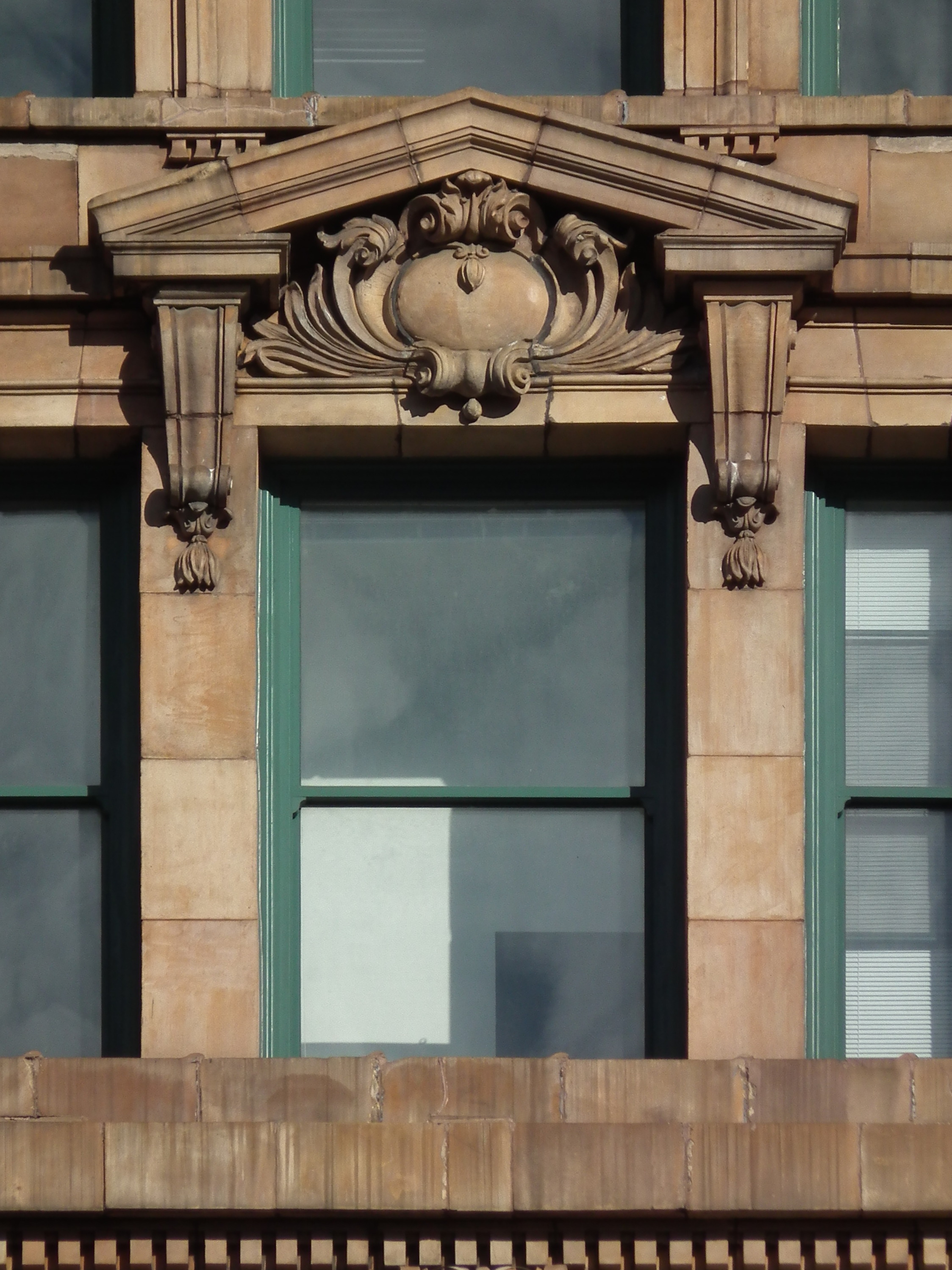
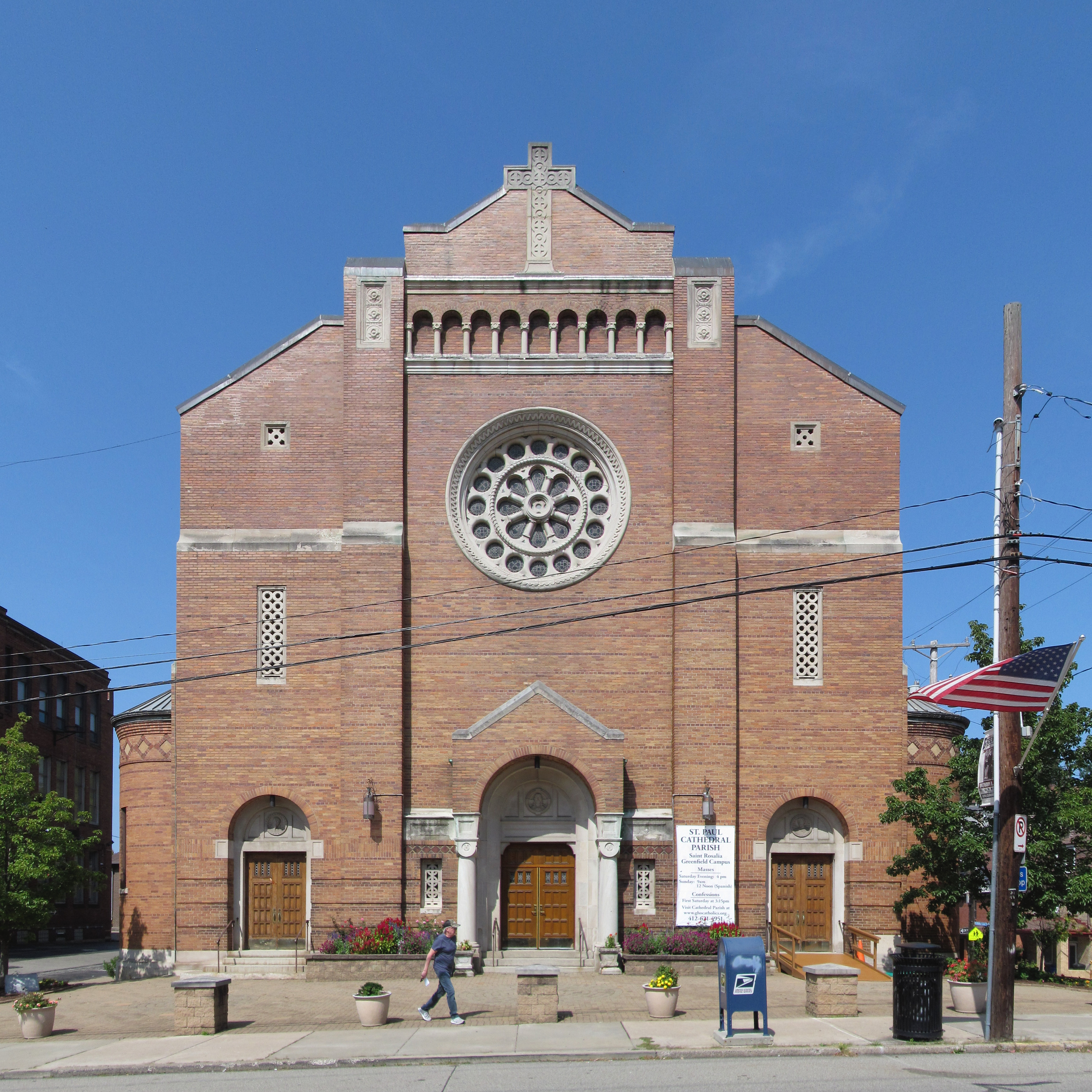
Designed by A. F. Link, this Romanesque church was begun in 1923 and opened in 1925. The style is transitional: it uses traditional Romanesque elements, but it is already veering toward the Art Deco modernist interpretation of those elements that would become common in the 1930s through the 1950s.
The cross at the top of the (liturgical) west front sets the modernist tone for the decorations.
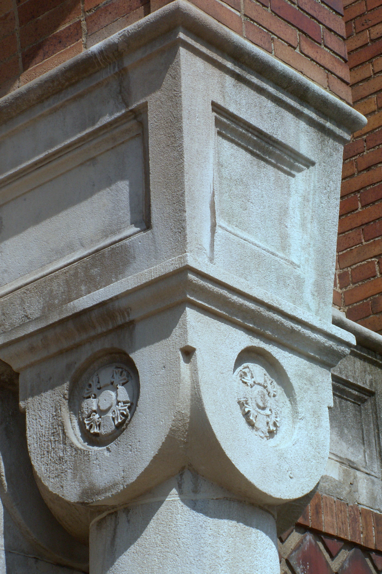
These abstract capitals continue the streamlined modernist theme, as do the three lunettes (Mary, Jesus, Joseph) on the west front:
Though it is a complex design, the rose window echoes the streamlining of the capitals and other details.
In contrast to the Deco streamlining of the front, the side of the church, with its crenellations and complex brickwork, could almost pass for a middle-1800s church by Charles F. Bartberger. Yet the styles fit together; there is no dissonance between the different views of the church.
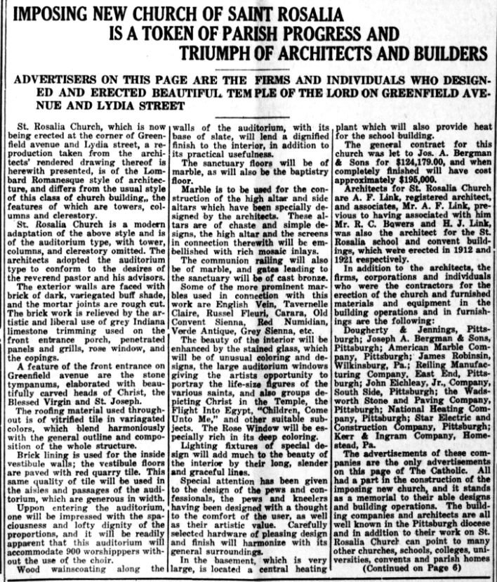
For those who are interested, here is a Pittsburgh Catholic article published March 27, 1924, that identifies many of the contractors and artists who worked on the church.
Ulysses L. Peoples was the architect of this school, which opened in 1902 and even then was something unique.
The building itself is a tasteful but not extraordinary example of Romanesque style with Renaissance overtones—something we might call Rundbogenstil, because we like to say the word “Rundbogenstil.” It is a little bedraggled-looking now, because it closed in 2005. The more modern addition (by the time it was added this was known as the Madison Elementary School) has been adapted for the Pittsburgh Playwrights Theatre Company, but nobody seems to know what to do with the original section.
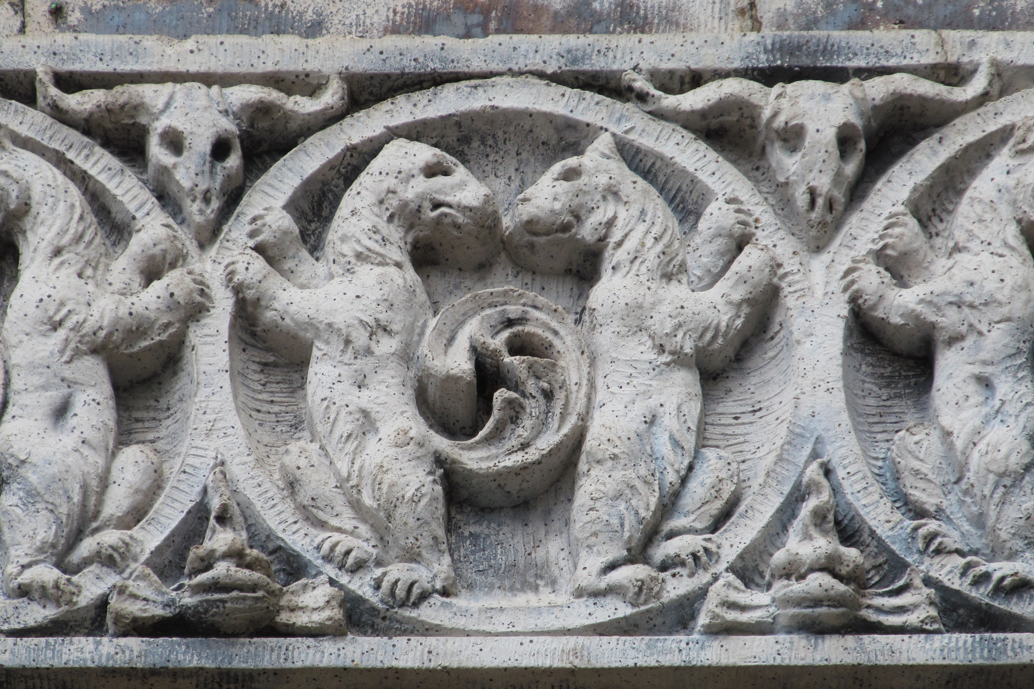
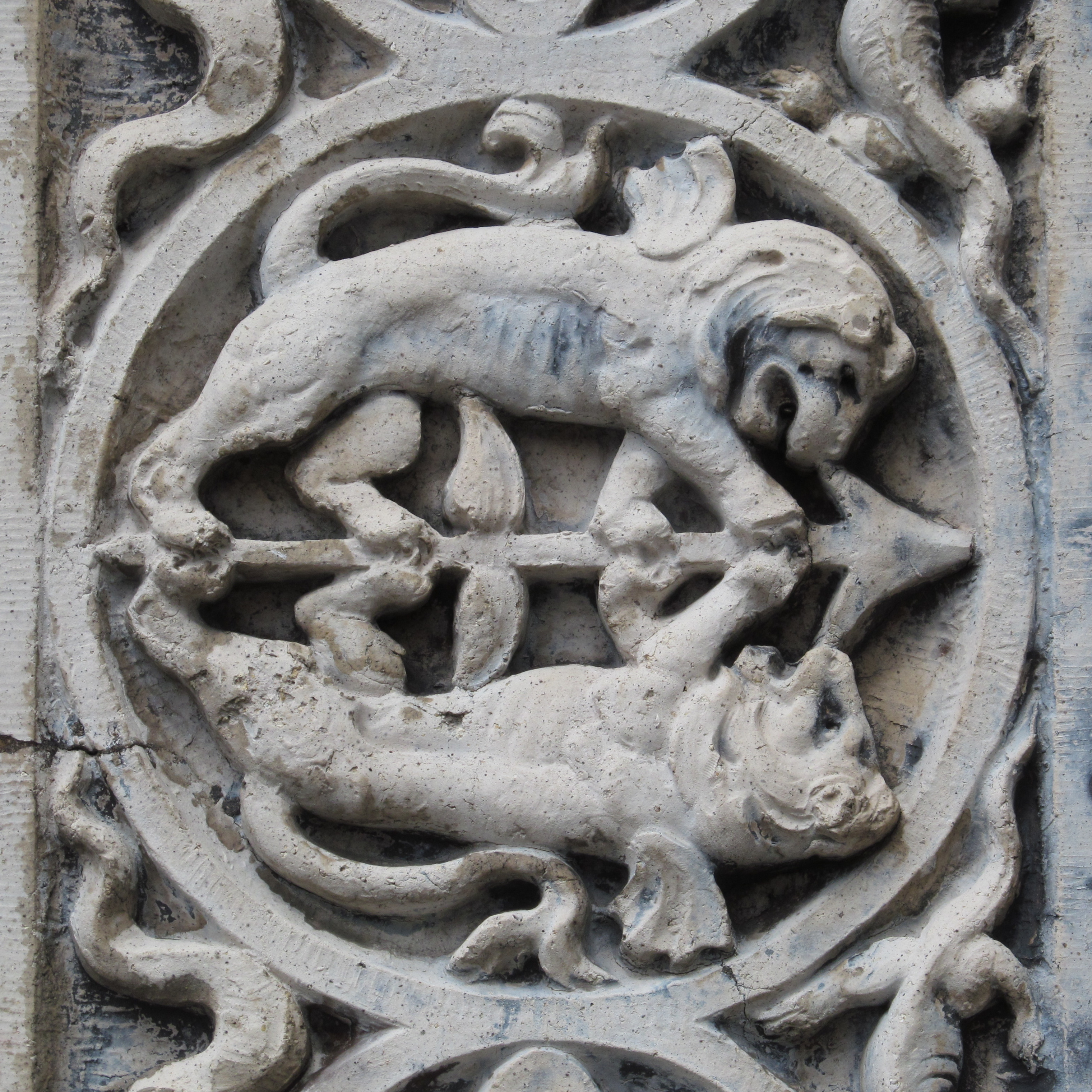
A fine piece of work for a small school, like many another Romanesque school in Pittsburgh. But the carved decorations around the entrances are like nothing else in the city, or possibly on earth.
It seems as though the architect and the artist had conceived the curious notion that children should find school delightful, and that the entrance should convey the message that here is a place where we are going to have fun.
The side and rear of the building. The rear, facing an alley, is done in less expensive brick.
The later addition, from 1929, is by Pringle & Robling in quite a different style, a lightly Deco form of modernism.
The gargoyles on the Church of the Assumption capture the true medieval spirit of inspired grotesquerie and goofiness and filter it through a twentieth-century sensibility. This gargoyle is having a bad day.
This one on the side of the building seems to be above a chimney vent. It demonstrates, in a silly way that would have appealed to the medieval sense of humor, one of the torments prepared for the damned.


_(14785999743).jpg)