Allegheny General is one of the few classic skyscrapers in Pittsburgh outside downtown. It was built in 1926; the architects were York & Sawyer. These views were taken with a long lens from across the Allegheny River.
Below, with bonus pigeons:
A change in the light makes quite a different picture:
This building, put up in 1930–1931, was a branch of the Federal Reserve Bank of Cleveland, and the Clevelanders Walker & Weeks were the architects—but with Henry Hornbostel and Eric Fisher Wood as “consulting architects.”1 Old Pa Pitt doesn’t know exactly how far the consulting went. At any rate, the architects chose sculptor Henry Hering, who had done several prominent decorations in Cleveland, to create the cast-aluminum reliefs for this building. The picture below is from 2015, but it will serve to show the placement of the reliefs:
The three main figures are obviously allegorical; they seem to represent industry, agriculture, and the professions.
Source: Walter Kidney, Henry Hornbostel: An Architect’s Master Touch, where this building is no. 137 in the List of Works. ↩︎
The border between McKees Rocks and Stowe Township is whimsical. It cuts diagonally across the Bottoms, bisecting several buildings, so that this firehouse in the shadow of the McKees Rocks Bridge is actually in Stowe Township. In fact, the hypotenuse of this triangular building is the McKees Rocks border.
The architect, whoever it was, responded to an odd-shaped site with an Art Deco building that emphasizes its own triangularity. Since, as old Pa Pitt has remarked before, firehouses are basically men’s clubs, and men’s clubs always block in their windows, this building has lost several of its ground-floor windows. Otherwise it appears to be in close to original shape. It is still in use as a firehouse; it appears on Google Maps both as “Preston Volunteer Fire Department,” which is marked as a fire station, and “Independent Hose Co #5,” which is marked as a bar.
This Art Deco building probably dates from the 1930s. The sharply rectangular forms are softened and enriched by textures in terra cotta, making a composition that should please both classicists and modernists.
Father Pitt has pictured this building before, but here are two more pictures. This would be an undistinguished modernist box except for the patterns in the bricks, which elevate the whole building to Art Deco and make it an ornament to its corner rather than an unfortunate relic of the middle twentieth century.
This splendid little auditorium combines the Jacobean style of the main school with a hint of Art Deco. Father Pitt does not yet know who designed the addition. The original school was a design by MacClure & Spahr, and we know that Benno Janssen designed additions to more than one MacClure & Spahr building; this would certainly be in the range of Janssen’s style.
Update: Thanks to our correspondent David Schwing, we know that the architects were Link, Weber & Bowers, an all-star firm of local ecclesiastical architects.1 The article follows as it was originally published.
This is about as perfect as an Art Deco storefront can get. What is especially cheering is that the ground floor is a new construction, using modern stock materials to create a storefront that matches the spirit of the rest of the building. Until a little more than twelve years ago, the ground floor had been bricked up in an unsympathetic fashion, as you can see in a 2008 image from Google Maps.
Father Pitt does not know what the initial K stands for at the top of the façade, and would be delighted to be informed. (Update: K is for H. S. Kossler, who commissioned the building.)
Source: Pittsburgh Post-Gazette, April 12, 1930. “Plans have been prepared by Link, Weber and Bowers, architects for a store and apartment building, to be erected at 442 Main Street, West End, for H. S. Kossler.” Now 450 West Main Street; the Italianate building to the right is 440. ↩︎
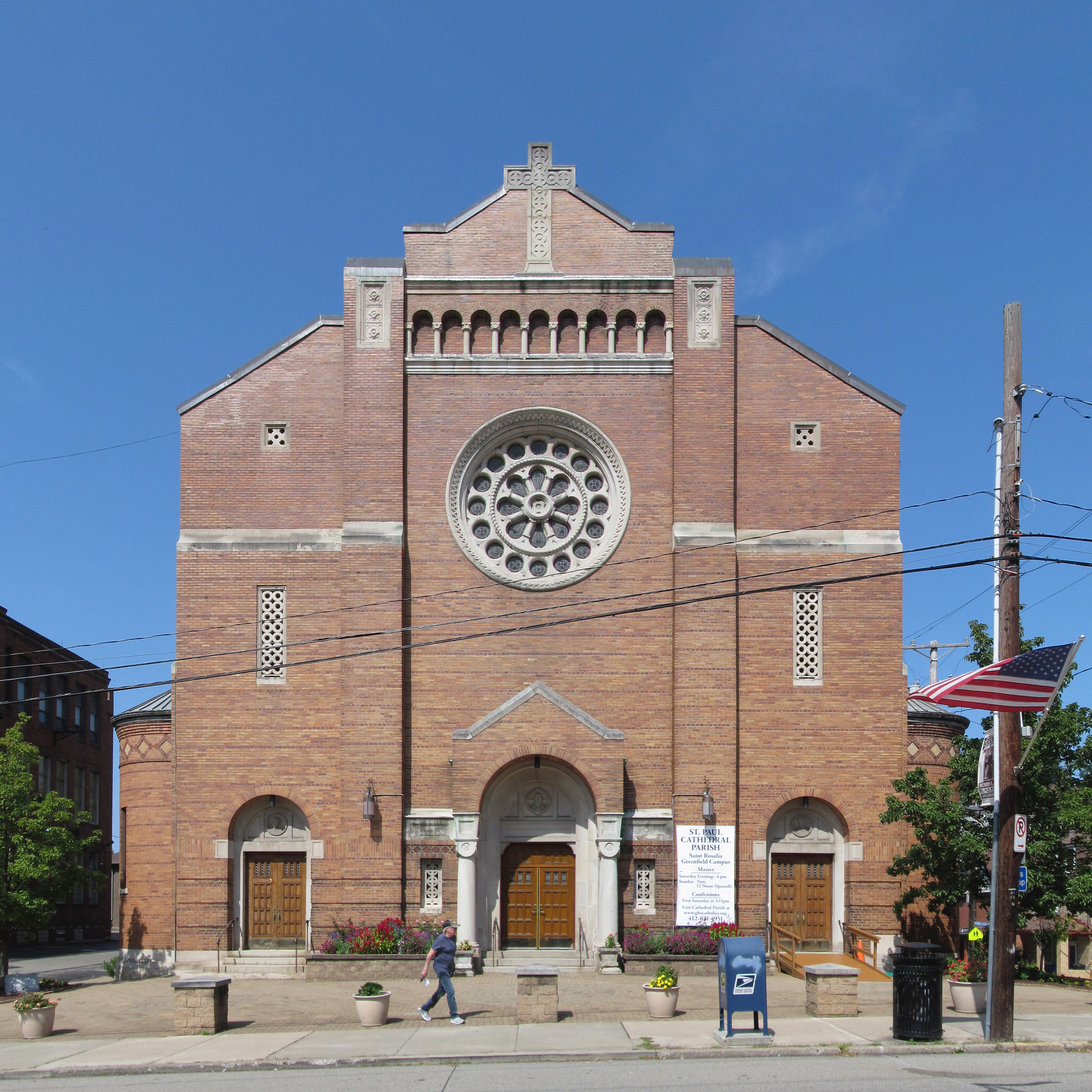
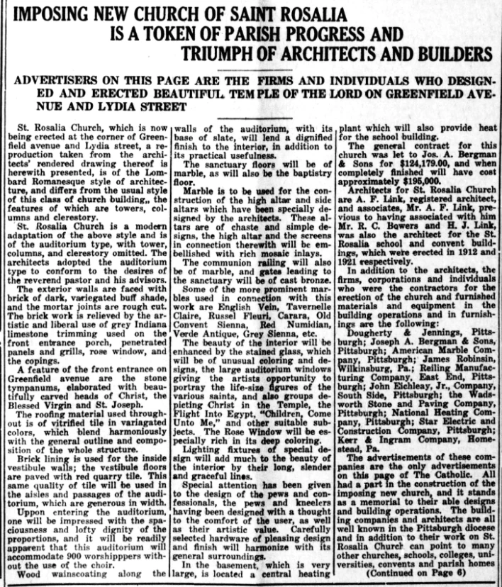
Designed by A. F. Link, this Romanesque church was begun in 1923 and opened in 1925. The style is transitional: it uses traditional Romanesque elements, but it is already veering toward the Art Deco modernist interpretation of those elements that would become common in the 1930s through the 1950s.
The cross at the top of the (liturgical) west front sets the modernist tone for the decorations.
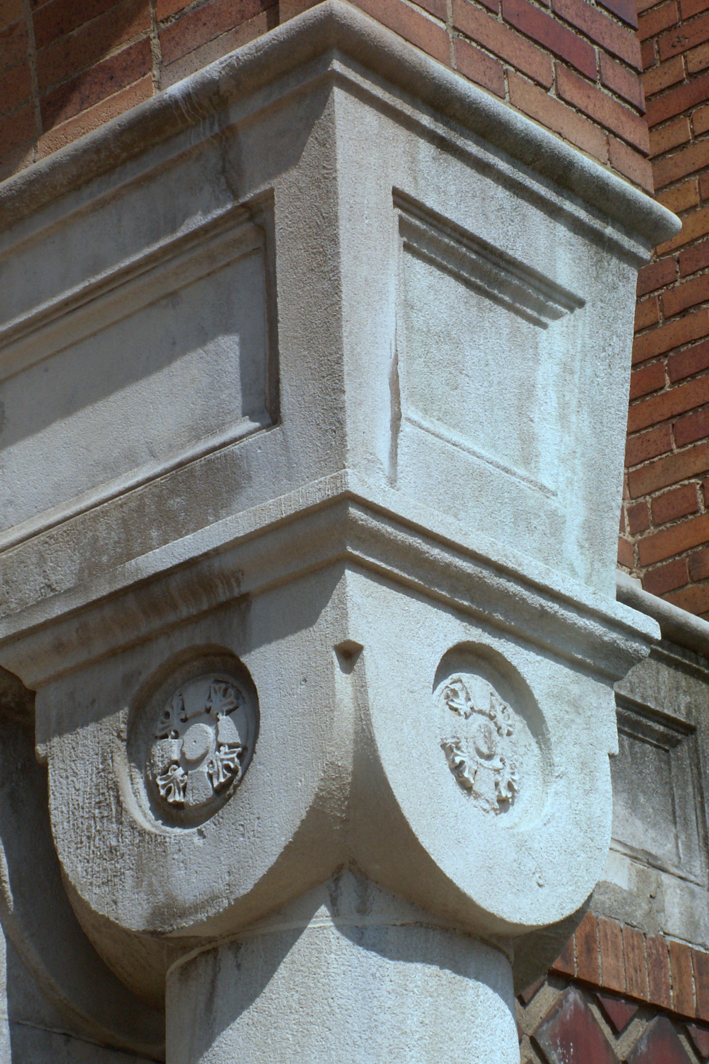
These abstract capitals continue the streamlined modernist theme, as do the three lunettes (Mary, Jesus, Joseph) on the west front:
Though it is a complex design, the rose window echoes the streamlining of the capitals and other details.
In contrast to the Deco streamlining of the front, the side of the church, with its crenellations and complex brickwork, could almost pass for a middle-1800s church by Charles F. Bartberger. Yet the styles fit together; there is no dissonance between the different views of the church.
For those who are interested, here is a Pittsburgh Catholic article published March 27, 1924, that identifies many of the contractors and artists who worked on the church.
Above is the old Carron Street Baptist Church, which as you might guess is on Carron Street. It has not been a church for quite a while, and it has gone through some substantial alterations on its way to becoming a garage, so old Pa Pitt is not quite sure whether it ought to be added to the collection of churches with the sanctuary upstairs, or whether it simply had a high basement. (Update: The answer is that it had a high basement. The church was designed by the Beezer Brothers, and we have found the architects’ original rendering.)
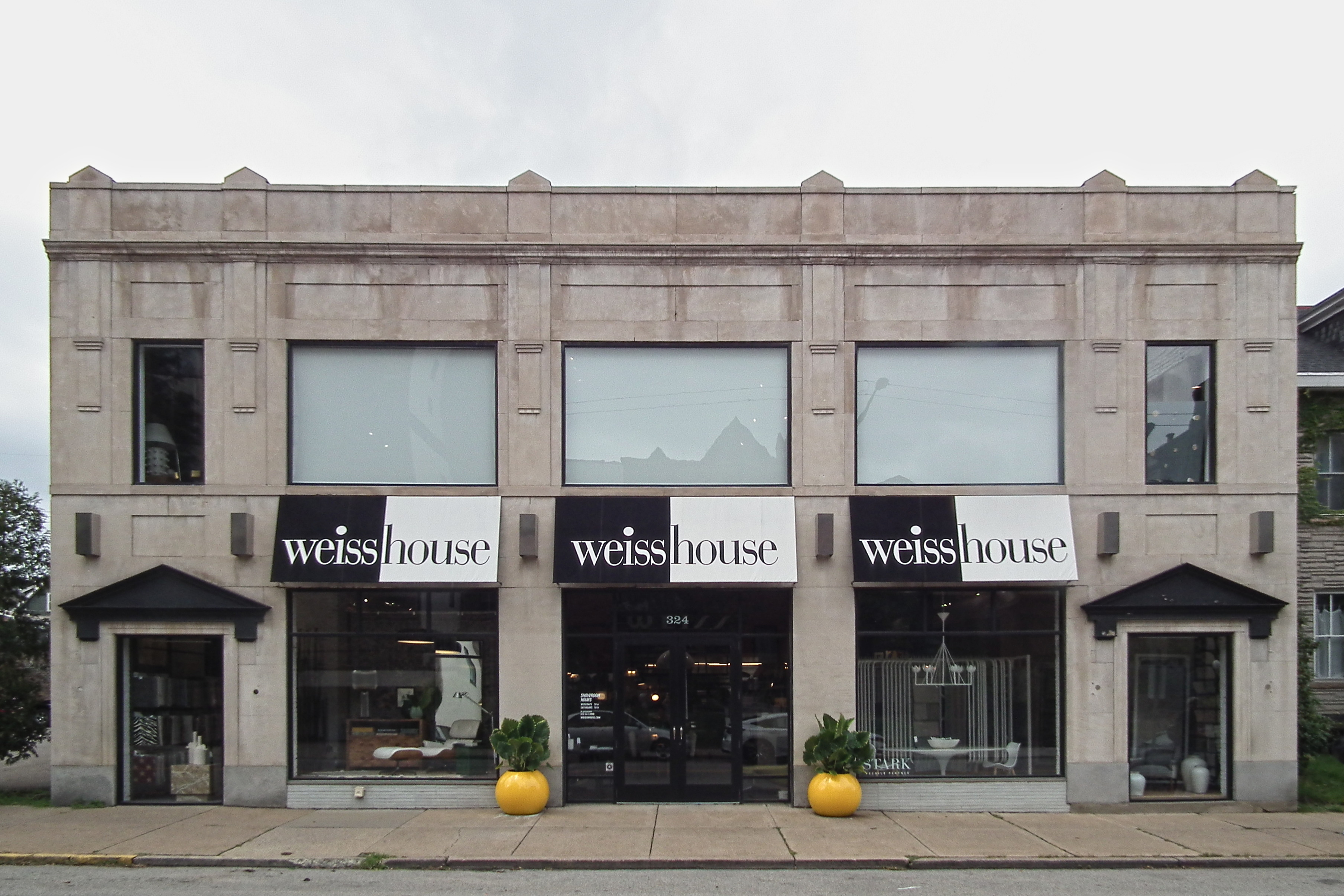
From the church that became a garage we walk just about a block to the garage that became a high-class furniture store.
This was the South Highland Garage, and as a work of architecture it is probably more distinguished than the Carron Street Baptist Church ever was. (Update: Having seen the original rendering of the church, old Pa Pitt unreservedly withdraws this statement.) If you like, you may formulate your own sarcasm about the true American religion and our fitting sense of architectural priorities. But then you can remember that Calvary Episcopal Church and Sacred Heart are just a short stroll away, and your sarcasm will wither on your tongue.
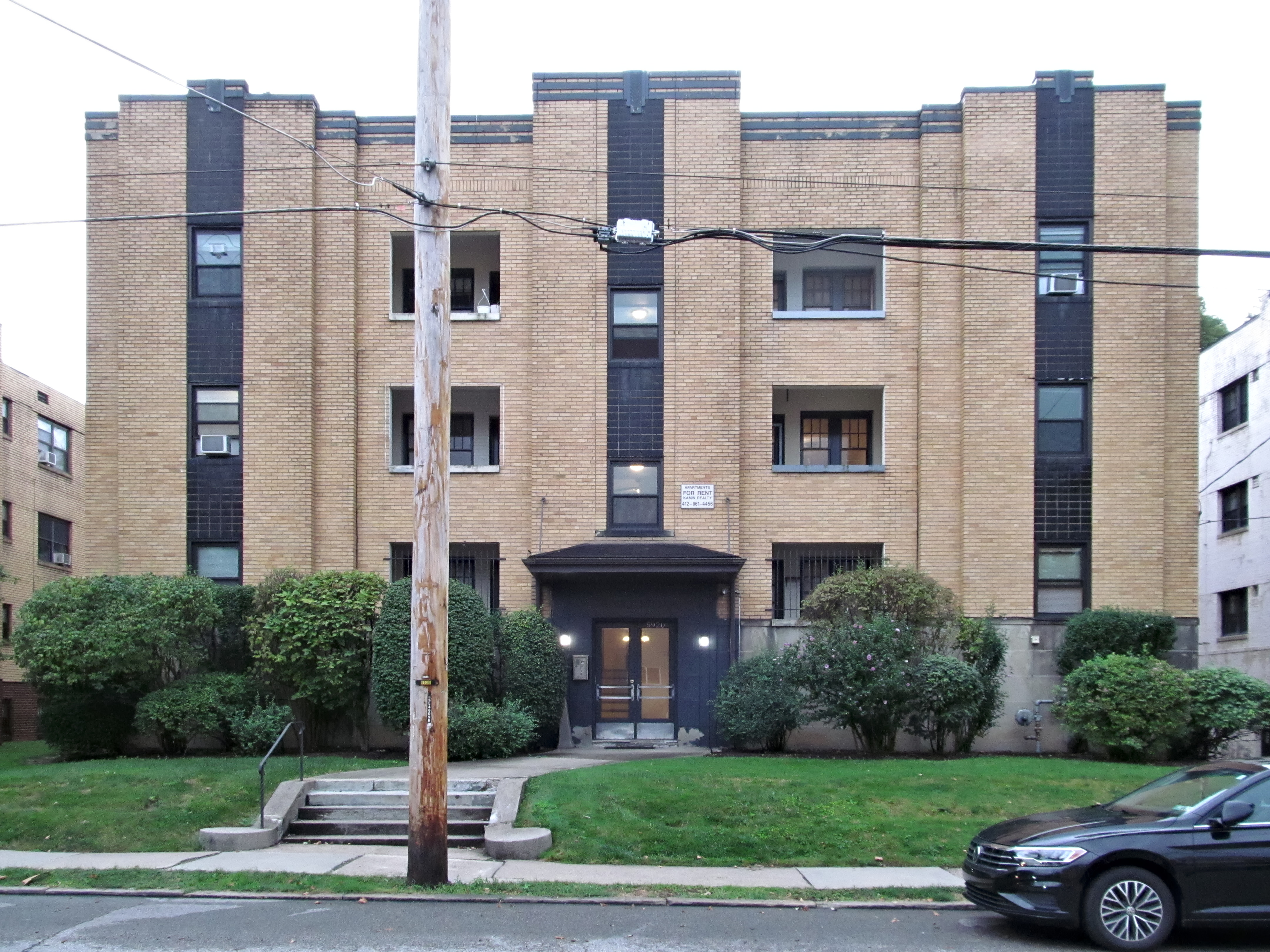
Ornament is minimal but effective on this moderne apartment building on Walnut Street. The front has a classical symmetry emphasized by strong black verticals, with cornice bands tied together in little deco knots. The inset balconies at first hardly register as balconies, but give the apartments behind them a private outdoor space.