Although the subway spur to Penn Station is not in regular use, it is kept in working order for emergencies and special events. The subway downtown has been interrupted at Wood Street for track reconstruction, so trolleys are diverted to Penn Station, with a shuttle bus to Gateway.
The Keystone Athletic Club was designed by Benno Janssen, Pittsburgh’s favorite architect for high-class clubs of all sorts. Most of them were classical in style, but for this skyscraper clubhouse Janssen chose a simple and streamlined Gothic style instead. It is now Lawrence Hall, the main building of Point Park University, so that two universities in Pittsburgh have trademark Gothic skyscrapers.
Early in his career, Benno Janssen was a fiend for terra cotta; he was much more restrained later on, but he usually included some characteristically appropriate terra-cotta ornaments.
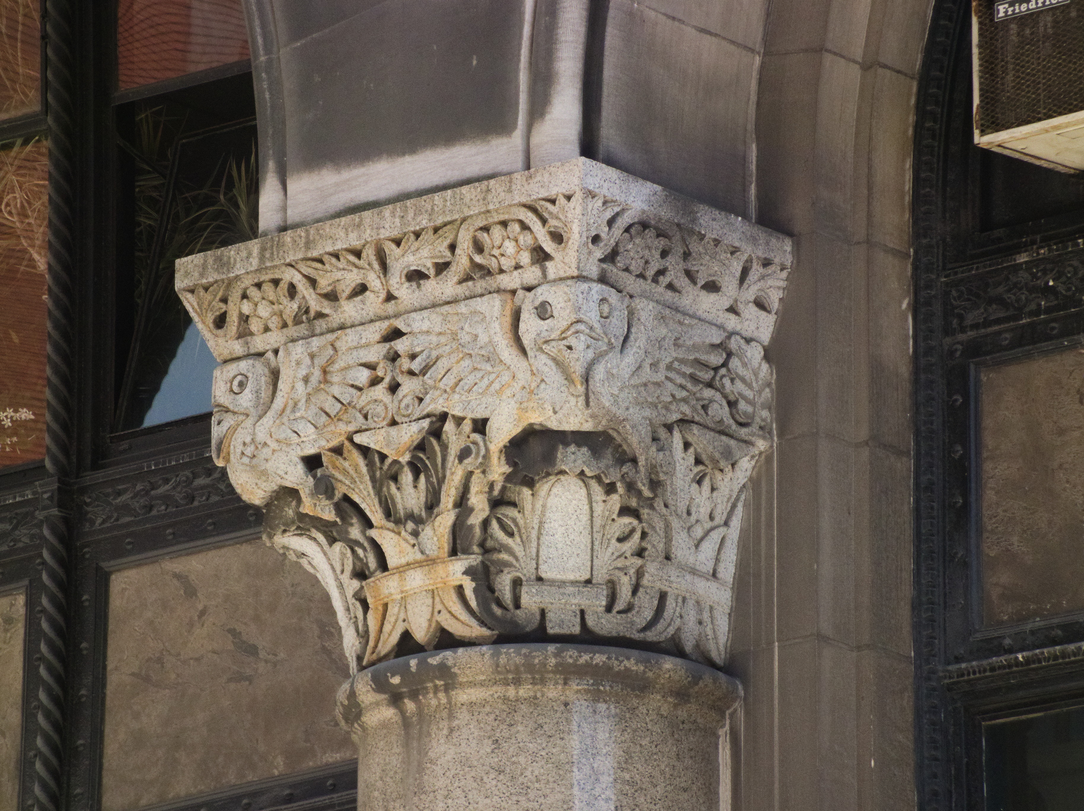
The Times Building, designed by Frederick Osterling in his Richardsonian Romanesque period, is a block deep, so it has fronts on both Fourth Avenue and Third Avenue. The Fourth Avenue front is narrower; the Third Avenue front has one more bay, and a single grand arch in the middle. The decorative carving is probably by Achille Giammartini, who is known to have worked with Osterling on the Marine Bank and the Bell Telephone Building, and all his trademark whimsy is on display here.
The County Office Building, which opened in 1931, was designed by Stanley L. Roush, who was the king of public works in Allegheny County for a while. Its combination of styles is unique in Pittsburgh, as far as old Pa Pitt knows. In form it is of the school Father Pitt likes to call American Fascist, the weighty classical style filtered through streamlined Art Deco that was popular for American public buildings between the World Wars, and of which the grandest example in Pittsburgh is the federal courthouse. But the details are Romanesque rather than classical—an acknowledgment of the lingering influence of the great Richardson’s greatest masterpiece, the Allegheny County Courthouse. The carved ornaments are Art Deco adaptations of medieval themes, except for the eagle above, which is not at all medieval, and which clasps the arms of Allegheny County in its talons.
The Fourth Avenue side. The County Office Building is roughly square, so the four sides are similar, except that this side lacks an entrance. But this was the side that was lit by the sun when Father Pitt was taking pictures. It took a lot of fiddling and adaptation to get the whole side of the building across a tiny narrow street, so you will see stitching errors and other anomalies if you enlarge the picture.
Chinatown in Pittsburgh was an almost stiflingly dense neighborhood that was virtually destroyed when the Boulevard of the Allies ramp was built. Nevertheless, a number of Chinese merchants and organizations rebuilt on Court Place, the new street along the base of the ramp. This building was designed by Sidney F. Heckert, otherwise known as a reliable architect of Catholic schools and churches. It goes right through from Court Place (above) to Third Avenue (below), and for many decades it has been the home of the Chinatown Inn, the only remaining Chinese business in Chinatown.
Two firehouses went up back to back at the same time in 1900. The much more elaborate Engine Company No. 1 was built on Second Avenue, now the Boulevard of the Allies. Behind it on First Avenue was Engine Company No. 30, designed by the same architect—William Y. Brady—and built at the same time. Why they counted as two separate firehouses instead of one big firehouse is a question for the fire department.