Tag: Relief

  • Auditorium Entrance, Andrew W. Mellon Middle School, Mount Lebanon

    Entrance to Andrew W. Mellon Middle School

    The National Forum warns us that we have to keep an eye on this school. All the schools of its era in Mount Lebanon were designed by Ingham & Boyd, or by Ingham, Boyd & Pratt once Pratt became a partner. This one comes from the era when they were adapting Art Deco elements to their usual ruthlessly symmetrical classicism, and the result shows some similarity to the same firm’s Buhl Planetarium. It has not changed much since it was built, except that, when the name was changed from “Junior High School” to “Middle School,” the inscription was clumsily applied with no spacing between the letters. That bugs old Pa Pitt, but he is not going to get up on a ladder and fix it himself.

    Medallion with theatrical masks

    Father Pitt does not know the sculptor of these two medallions, but he has a pretty good guess. Compare them to the reliefs by Sidney Waugh on Buhl Planetarium: The Heavens and The Earth and Primitive Science and Modern Science. It seems likely that the same architects hired the same sculptor for these reliefs.

    Medallion with lyre
    Marquee
    Fujifilm FinePix HS10.

    The marquee is festooned with unexpectedly colorful Art Deco swags.

  • Grotesques on the Western Theological Seminary, Allegheny West

    Yawning head

    The Western Theological Seminary (now West Hall of the Community College of Allegheny County) was built in 1914. It was designed by Thomas Hannah, but so far old Pa Pitt has not found the name of the sculptor who decorated the entrance with these delightful grotesques.

    Tower of the Western Theological Seminary (now West Hall)
    Yawning head face-on
    Mr. It Figures
    Mr. It Figures from the side
    Salamander
    Monkish head
    Tortoise
    Grotesque staring face
    Foliage skull
    Canon PowerShot SX150 IS.
  • Zion Evangelical Lutheran Church, Coraopolis

    Zion Evangelical Lutheran Church

    Here is a fine example of the last gasp of Gothic architecture in America. This church was built as late as 1951 in a style that would have seemed reasonably conservative twenty years earlier. The building has passed into the hands of the Immanuel Orthodox Presbyterian congregation, and members were spiffing up the grounds while old Pa Pitt was taking these pictures.

    Cornerstone: Zion Lutheran Church, 1899 • 1951
    West front entrance

    The west-front entrance is very similar to what William P. Hutchins did more than two decades earlier at St. Francis Xavier Church in Brighton Heights; perhaps they were both inspired by the same historical example.

    Entrance
    Chi-Rho with alpha and omega
    Hand
    Dove
    Lantern
    Lantern
    Zion Lutheran

    Around the corner, behind the church, is a Sunday-school building that dates from 1928 in a style we might call Educational Gothic.

    Sunday school
    Cornerstone: Zion Ev. Lutheran Sunday School Anno Domini 1928
    Sunday-school entrance

    Cameras: Fujifilm FinePix HS10; Canon PowerShot SX150 IS.

  • Niches on the College of Fine Arts Building, Carnegie Mellon University

    Henry Hornbostel designed the front of the Fine Arts Building with niches that display all styles of architectural decoration, and more practically give students a place to sit between classes. The niches have continued to accumulate sculpture in styles from all over the world. The whimsical figures in the Gothic niche may have been done by Achille Giammartini.

    Figure in first niche
    Figure in first niche
    Foliage with critters in first niche
    Lion eating an unfortunate Gothic figure
    Figure in first niche
    Figure in first niche
    Second niche

    In the classical niche, the three orders of Greek architecture: Corinthian, Doric, Ionic, demonstrated with correct proportions.

    Third niche
    Fourth niche
    Sculpture in Indian style, with Egyptian column
  • Decorations on the Maginn Building

    Arch on the Maginn Building

    Father Pitt is fairly certain that the ornamental stonecarving on the Maginn Building was done by Achille Giammartini, Pittsburgh’s master of Romanesque whimsies. The style is Giammartini’s, and the building was designed by Charles Bickel, who is known to have brought in Giammartini for the German National Bank (now the Granite Building) around the corner, as we see in this advertisement:

    Advertisement for Achille Giammartini

    But, you say, speculation is not enough for you. You want the artist’s signature. Well, to old Pa Pitt, this looks like a signature:

    Face with mustache in the corner of the arch

    In fact, Father Pitt has formed the hypothesis that Giammartini littered the city with self-caricatures in Romanesque grotesque. Several other buildings bear carved faces similar to these two in the corners of the arch on the seventh floor of the Maginn Building.

    Grotesque face

    The rest of the ornaments are also in Giammartini’s trademark style: lush Romanesque foliage with slightly cartoonish faces peering out from the leaves.

    Capital
    Capital with face
    Fujifilm FinePix HS10.
  • College of Fine Arts, Carnegie Mellon University

    Creare over the entrance

    The front of the College of Fine Arts in sunset light. Above, the word CREARE (“to create”) inscribed above the entrance by decorative sculptor Achille Giammartini.

    College of Fine Arts, Carnegie Mellon University
    Entrance
    Entrance decoration
    Ratio

    Reason.

    Cogitatio

    Design.

  • Decorations on the County Office Building

    Eagle and county arms

    The County Office Building, which opened in 1931, was designed by Stanley L. Roush, who was the king of public works in Allegheny County for a while. Its combination of styles is unique in Pittsburgh, as far as old Pa Pitt knows. In form it is of the school Father Pitt likes to call American Fascist, the weighty classical style filtered through streamlined Art Deco that was popular for American public buildings between the World Wars, and of which the grandest example in Pittsburgh is the federal courthouse. But the details are Romanesque rather than classical—an acknowledgment of the lingering influence of the great Richardson’s greatest masterpiece, the Allegheny County Courthouse. The carved ornaments are Art Deco adaptations of medieval themes, except for the eagle above, which is not at all medieval, and which clasps the arms of Allegheny County in its talons.

    County Office Building

    The Fourth Avenue side. The County Office Building is roughly square, so the four sides are similar, except that this side lacks an entrance. But this was the side that was lit by the sun when Father Pitt was taking pictures. It took a lot of fiddling and adaptation to get the whole side of the building across a tiny narrow street, so you will see stitching errors and other anomalies if you enlarge the picture.

    Gargoyle

    An Art Deco gargoyle.

    Capital
    Capital
    Capital
    Capital
    Capital
    Capital
    Capital
    Decorative relief
    Frieze
    Fujifilm FinePix HS10.
  • A Splendid Commercial Building in Manchester

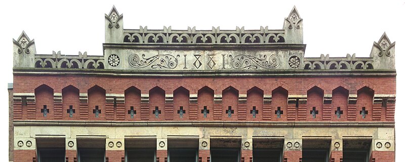
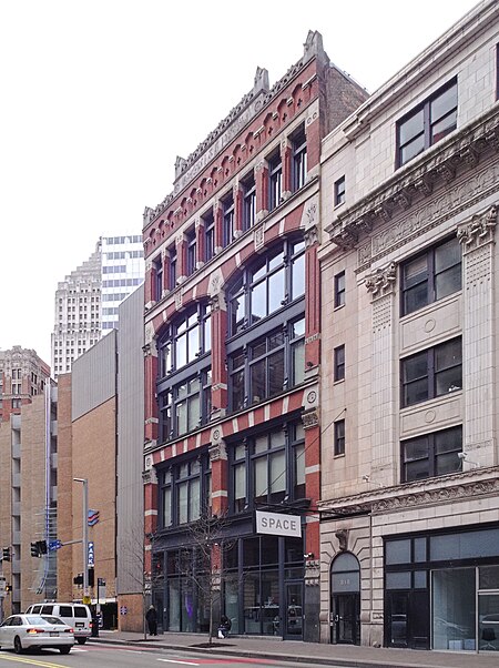
    1401 Columbus Avenue

    Columbus Avenue is at the ragged back end of Manchester, where there are still many crumbling and abandoned buildings. This one, however, has been beautifully restored; it is the home of a marketing company that obviously sees the value in having a landmark building for its headquarters.

    1887 on the date stone
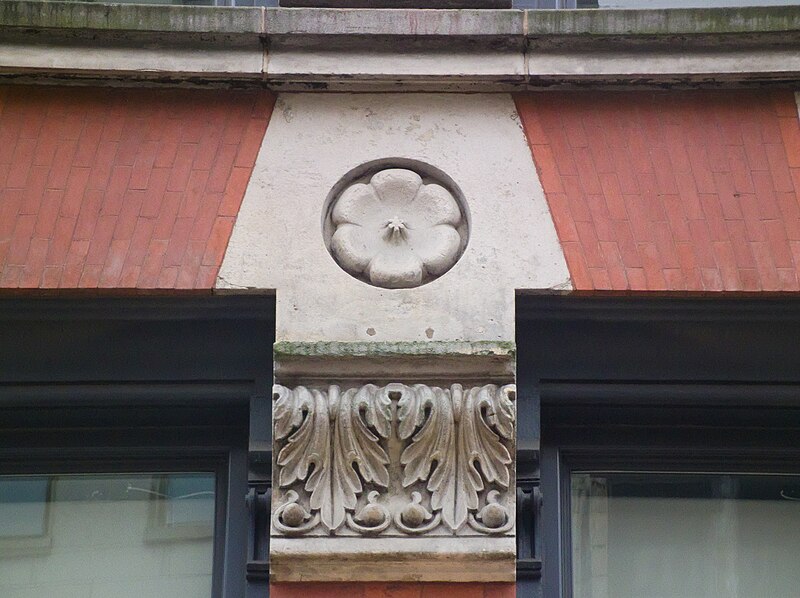
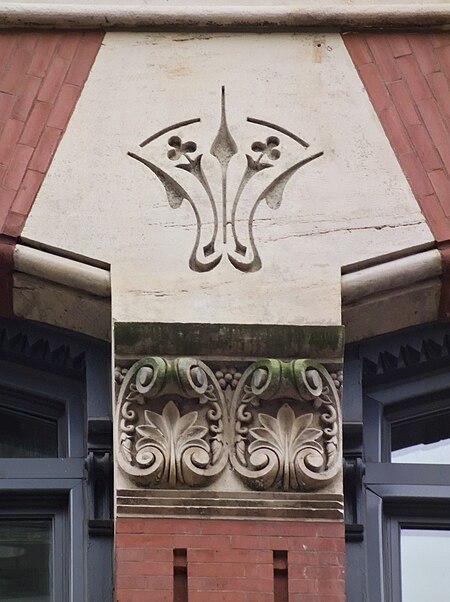
    Decoration
    Terra cotta
    Bracket
    Floral ornament
    1401 Columbus Avenue
    Kodak EasyShare Z981.
  • W. J. Gilmore Drug Company Building

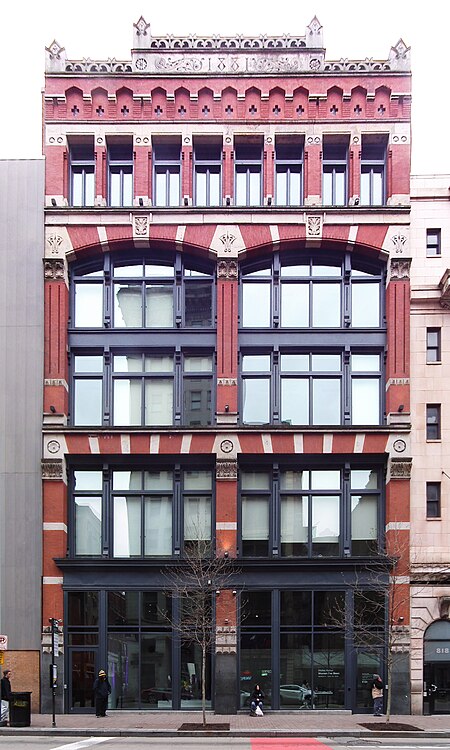
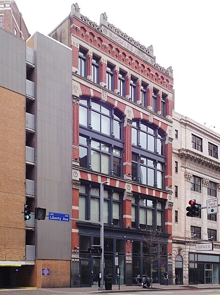
    W. J. Gilmore Drug Company Building

    This feast of deco-Gothic terra cotta on the Boulevard of the Allies was designed by Joseph F. Kuntz, who worked for the Wm. G. Wilkins Company. It opened in 1925. Several of Kuntz’s buildings are notable for their terra-cotta fronts: see, for example, the Maul Building and the Hunt Armory.

    View along the front
    Ornament
    Ornaments
    Ornament
    Metalwork
    Probably cast iron
    Transom
    Ornament
    Perspective view
  • Under the Rotunda at Penn Station

    Skylight in the Rotunda

    The rotunda of Penn Station is such a remarkable structure that it has its own separate listing with the Pittsburgh History and Landmarks Foundation. The skylight is a fine example of abstract geometry in metalwork.

    Arch in the rotunda

    The current owners of the Pennsylvanian hate photographers and tourists who come up to see the rotunda, and post signs on the walk up to the rotunda warning that this is private property and no access beyond this point and, with dogged specificity, NO PROM PHOTOS. But old Pa Pitt walked up through the parking lot, taking pictures all the way, and therefore saw the signs only on the way back. Sorry about that, all ye fanatical upholders of the rights of private property, but these pictures have already been donated to Wikimedia Commons, so good luck getting them taken off line.

    Face above Philadelphia

    The four corners of the earth, or at least the four corners of the Pennsylvania Railroad, are represented on the four pillars of the rotunda.

    Pittsburg

    “Pittsburg” was the official spelling, according to the United States Post Office, when the rotunda was built in 1900.

    Pittsburg
    Philadelphia
    Philadelphia
    New York
    New York
    Chicago
    Chicago