
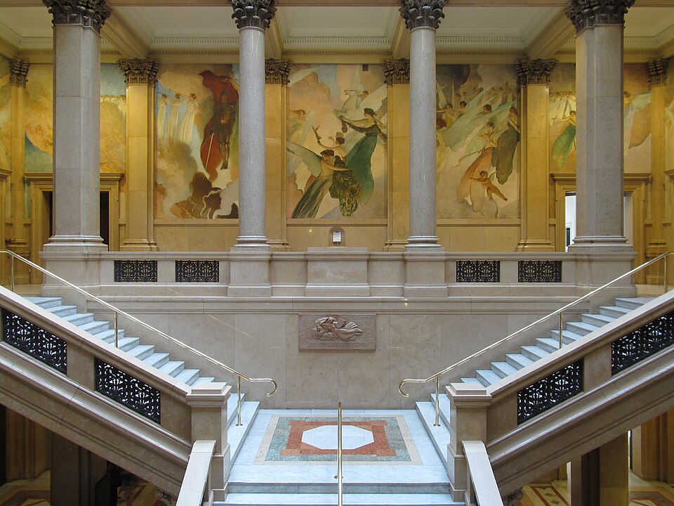
The building was designed by Longfellow, Alden & Harlow; the murals were painted by John White Alexander.

Comments

The building was designed by Longfellow, Alden & Harlow; the murals were painted by John White Alexander.


Donahoe’s was a prosperous market and restaurant that commissioned William E. Snaman to design this elegant commercial palace on Forbes Avenue. Its striking terra-cotta front is still magnificent from the second floor up.

The ground floor has been completely redesigned, though “designed” is a generous term, as we see in this picture from 2022.

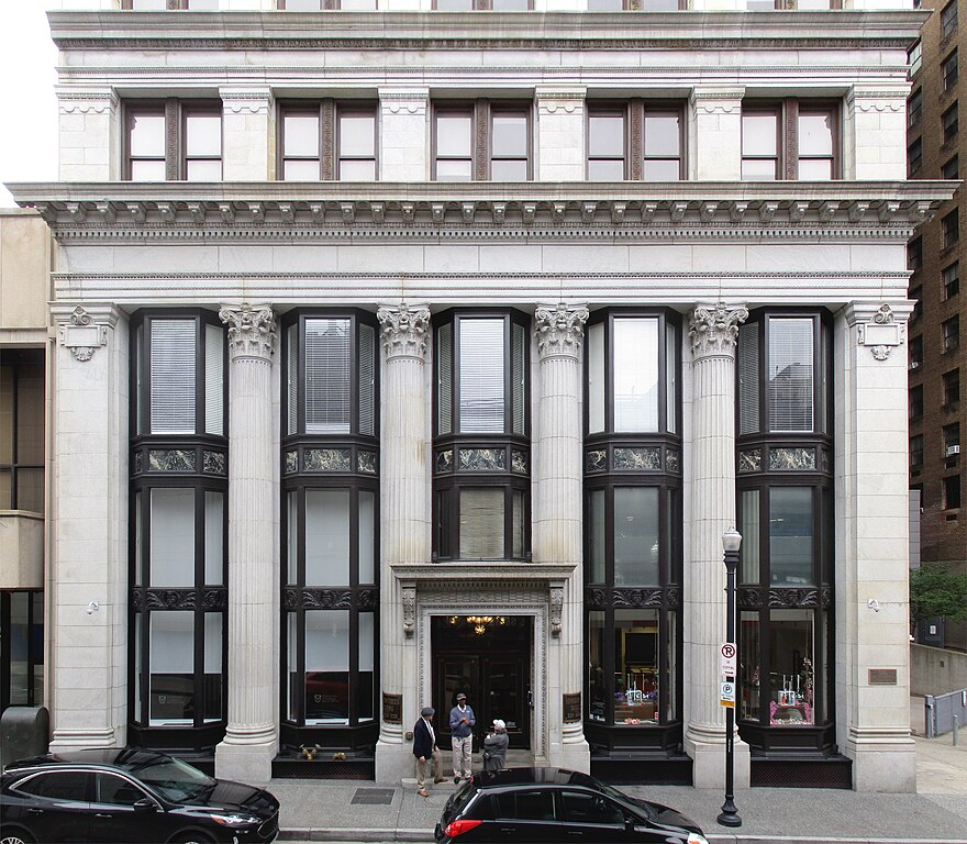
Built in 1905 as the Machesney Building, this early skyscraper was designed by Thomas Scott, who kept his office there, which doubtless made a strong first impression on potential clients. It was renamed eight years later when it was bought by a pair of oil barons, and it has been the Benedum-Trees Building ever since.
Here we see the generous base of the building, with three-storey Corinthian pilasters and huge windows. Above it is the “bosses’ floor.” For a short lesson in reading a Beaux Arts skyscraper like this, see our article on the West Penn Building.
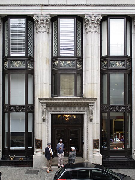
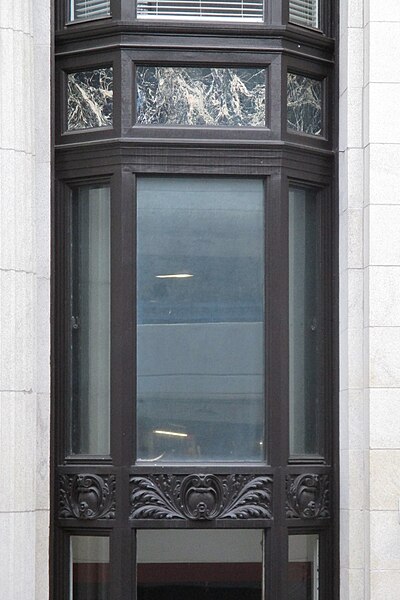

Fourth Avenue, the second-biggest American financial center after Wall Street, was famous for its bank towers. But one bank decided to go long instead of high. The Colonial Trust Company built a magnificent banking hall that ran right through from Forbes Avenue to Fourth Avenue, skylit all the way. Pittsburghers passing between Fourth and Forbes, especially in cold weather, would take the route through the bank so regularly that the hall became known as Colonial Avenue.
Frederick Osterling was the architect, and he designed this magnificent Corinthian face for the Forbes Avenue side.

What would a bank be without its lions?

Home-repair tip: if your pediment is broken, you can fill the gap with a baroque cartouche.
Two years ago, old Pa Pitt got pictures of the other entrances as well, so the rest of the pictures are reruns.
The Fourth Avenue side is in the same style, but narrower:

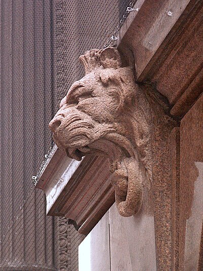
This side also has its lions.
In 1926, the bank decided to expand by building another equally magnificent hall perpendicular to the first, with an entrance on Wood Street. Osterling was the architect again—but fashions, and Osterling’s own taste, had changed.

Instead of florid Corinthian, this side is in a simpler Ionic style. The outlines are cleaner, and the wall of rectangular panes of glass and the shallow arch at the top seem almost modernistic. It is still a bravura performance, but perhaps a more perfectly controlled one.
Fortunately the whole building has been adapted as Point Park’s University Center, so it is not going anywhere, for the near future at any rate.

The interior of the P&LE terminal, now Pittsburgh’s most spectacular restaurant.
Addendum: According to the Inland Architect, the “quite elaborate” waiting room and stair hall were designed by Crossman & Sturdy, decorators, of Chicago. The architect of the building was William G. Burns, or possibly George W. Burns, depending on the source.

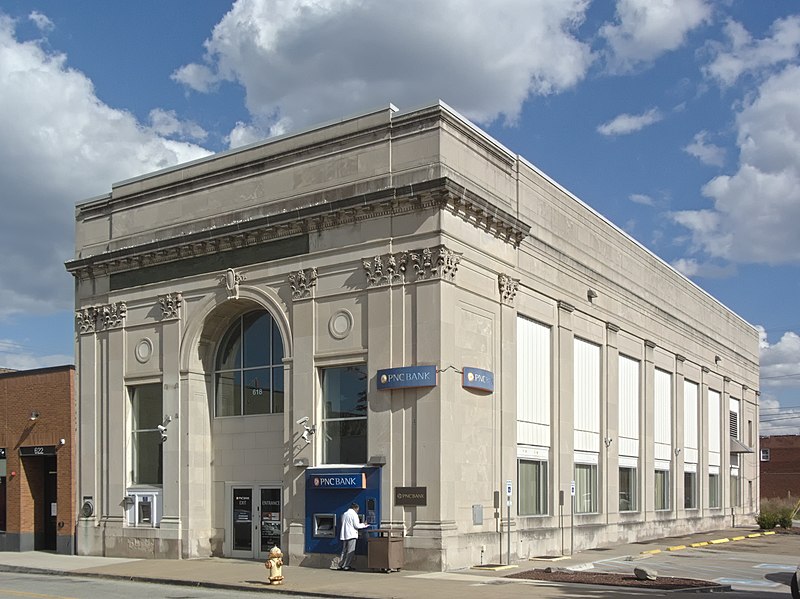
Here is another small bank that gets the architectural message exactly right, as we said a few days ago about the Carnegie National Bank. How could your money not be safe in a bank that looks like this? Imagine, too, how bright and cheerful the banking hall must have been before those tall windows along the side were filled in.

Winged chimeras guard the cartouche at the top of the great front arch.


Addendum: The bank was built in about 1924; the architects were Simons, Britton & English.1

You might pass this little building by without a second glance as you walked along Poplar Street, if you ever did walk along Poplar Street (a very pleasant street) in Castle Shannon. But if you did pause, you might notice the tall Corinthian columns and sturdy-looking quoins (those patterns in the bricks that are meant to look like cut stone) and think, “I wonder whether that used to be a bank.”
Then you would look up at the pediment, and all doubt would be removed.

The electric vault alarm still sits prominently in the pediment where a richer bank might have had an allegorical figure of Commerce.
To judge by old maps, this bank was built between 1890 and 1906.


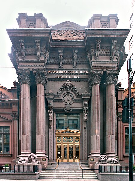
The adjective “tasteful” does not naturally attach itself to this structure. It has the look of a building specified by a banker who hired an expensive architect and was determined to wring every cent of his money’s worth out of the details. It is magnificent in a slightly horrifying way: this is the kind of monstrosity that was in the minds of the modernists when they condemned all things Victorian. Old Pa Pitt would not change a single swirl or swag or grotesque half-vegetable naked lady.
The architect in question was the firm of Isaac H. Hobbs & Sons from Philadelphia. Isaac H. Hobbs was a kind of celebrity architect. He was familiar to the thousands of ladies across our fair land who read Godey’s Lady’s Book, the premier fashion magazine of the middle 1800s: every month, Hobbs contributed a design for an elaborately Victorian residence for the lady readers to drool over. It was something like having a regular segment on a popular daytime talk show today. According to the Pittsburgh History and Landmarks Foundation’s Fourth Avenue walking tour (PDF), Hobbs designed a number of houses around Pittsburgh, but Father Pitt does not know any of them; he wonders whether they were original designs, or whether they were adaptations of the many designs published in Godey’s.

It appears that the crust of 150-year-old ornamentation requires some stabilization: netting is stretched over the top half of the building at the moment.


Otherwise not remarkable among the many classically inspired apartment houses in Shadyside, this one has an entrance that certainly stands out. It makes a spectacle of itself, in fact. The capitals on the massive square columns are more or less Corinthian, but Corinthian is usually the lightest and airiest-looking of the classical orders, whereas this construction gives the impression that it outweighs the whole building behind it.
This picture was taken with what might be called a toy camera. It was a no-name digital camera with stated 18-megapixel resolution, but clearly those 18 megapixels are achieved by multiplying some much smaller number of pixels. It may amuse you to enlarge the picture to full size and examine the results.