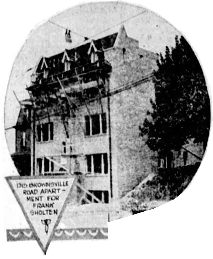
Even though it has lost some decorative details over the years, Castle Stanton still drops jaws of passers-by who find themselves in unfamiliar territory here on the border of East Liberty and Highland Park. It looks like a 1920s Hollywood set: we expect Douglas Fairbanks dressed as Robin Hood to leap from an upstairs window and land on his feet after a series of spectacular acrobatics.
This advertisement from the Pittsburgh Press, September 21, 1930, shows us some of the pointy bits that have since been removed.
This Hollywood front hides an unexpected secret, which will be revealed if we walk around to the side of the building.
Now we see the outlines of an older Queen Anne mansion, converted to an apartment house by the addition of a Hollywood-fantasy front facing Stanton Avenue.
This odd-looking apartment building on Stanton Avenue in Highland Park makes some sense once we peel apart its history. At first old Pa Pitt didn’t know what to make of it, but looking on old plat maps made him realize that the central section was a grand house in the Second Empire style, probably built in the 1870s.
In your imagination, take away those sunrooms on the first and second floors. Add a front porch the width of the house. You might put a Second Empire mansard cupola on the central tower. The result would be a lot like this:
This is Baywood, the Alexander King mansion at the other end of Highland Park (pictures here and here). The house at the core of this apartment building probably looked much like Baywood when it was new. It seems to appear first on the 1882 layer at Pittsburgh Historic Maps, where the property owner is not identified. In 1890 it is shown as belonging to A. Dempster, and it still belonged to A. Dempster in 1910, with its original outlines. In 1923 it has its current shape, and the owner is shown as G. West.
At some time around World War I, then, when several of the houses on Stanton Avenue were being converted to apartments, someone bought the Dempster mansion and decided to expand it into an apartment building. But the Second Empire style was embarrassingly passé. The new wings were done in an up-to-the-minute Spanish Mission style, and the original house was coated with stucco and modified as much as practical to go with the new style. Nothing, however, could disguise the outline of a Second Empire mansion. Thus today we have a clash of styles that is probably more interesting, visually speaking, that a new apartment house in pure Mission style would have been.
Tasso Katselas designed this mixed-use building, an apartment tower on top of a parking garage. It opened in 1966. For a while it was known by its address as 625 Stanwix Tower. Now it has been refurbished and given a spiffy new coat of black, which makes a big difference in its appearance. Compare the picture old Pa Pitt took from across the Allegheny nine years ago:
Back then, Father Pitt was a bit harsh in his criticism: “There is no rhythm to the apartment section, not even a jazzy syncopation,” he wrote. But the new coat of black emphasizes the vertical lines and gives the building exactly the rhythm it was missing—which turns out to be a jazzy syncopation.
Designed by Washington (D. C.) architect Philip Morison Jullien, the Fairfax was one of the grandest apartment houses in Pittsburgh when it opened in 1927. It certainly isn’t our biggest apartment building now, but it still makes a strong impression as you walk past on Fifth Avenue.
The northwest side of Broadway Avenue in Dormont is lined with small to medium-sized apartment buildings and duplexes. There’s a variety of styles, but we suspect more than one of them came from the pencil of Charles Geisler, who designed many apartment buildings in Dormont and Mount Lebanon, and who lived not far away in Beechview.
These two are exceptionally convenient to transit: their front doors open right across from the Stevenson stop on the Red Line.
We saw Neville House in color earlier. These three monochrome pictures were taken with a Kodak Retinette made in the middle 1950s. Above, the exit from the porte cochere under the building. Below, the main entrance, including the porte cochere and the patio in front of it.
Thanks to Bodega Film Lab for developing the film and making it worth taking the Retinette out for a walk.
This large apartment development between Railroad Street and the Allegheny opened in 2016. WTW Architects were the architects of record, and this is a good example of the type of patchwork-quilt architecture that has been fashionable in the last decade or two. On the one hand old Pa Pitt thinks these buildings are much more interesting than the plain brick boxes that were fashionable after the Second World War. On the other hand, bricks last, whereas Father Pitt fears some of these other materials will begin to look a bit scraggly in about fifteen years.
On the southeast side of Voelkel Avenue in Dormont are three eye-catching apartment buildings. Since patterned brickwork was a favorite trick of Charles R. Geisler, the most prolific designer of apartment buildings in Dormont and Mount Lebanon, old Pa Pitt suspects he was responsible (but of course would be happy to be contradicted by someone with real information). The building above has kept its original art glass in the stairwell, but the front windows of the apartments have been replaced with modern picture windows.
This one has a different configuration of apartment windows, possibly more like the original. It has lost its art glass in the stairwell, however.
The entrance to the D’Alo, on the corner of Voelkel and Potomac Avenues.
Across the street are two smaller apartment buildings with a similar riot of patterned brick. We suspect Geisler has struck again.