Another experiment with limited color. Old Pa Pitt enjoys all kinds of photographic experiments, but in this case he has a particular reason for presenting this picture this way: it was a photograph that could not be easily rescued in full color.
You may see the original color photo below if you really want to see it. Father Pitt will draw back the curtain for a moment and reveal the insignificant man with the levers and switches.
In spite of much manipulation, including a gradient filter applied in the GIMP, the highlights are still bleached out completely, making it look like a picture from a cheap cell phone rather than Pa Pitt’s treasured Olympus E-20n.
Reducing the saturation made it look more artificial without making it look more attractive.
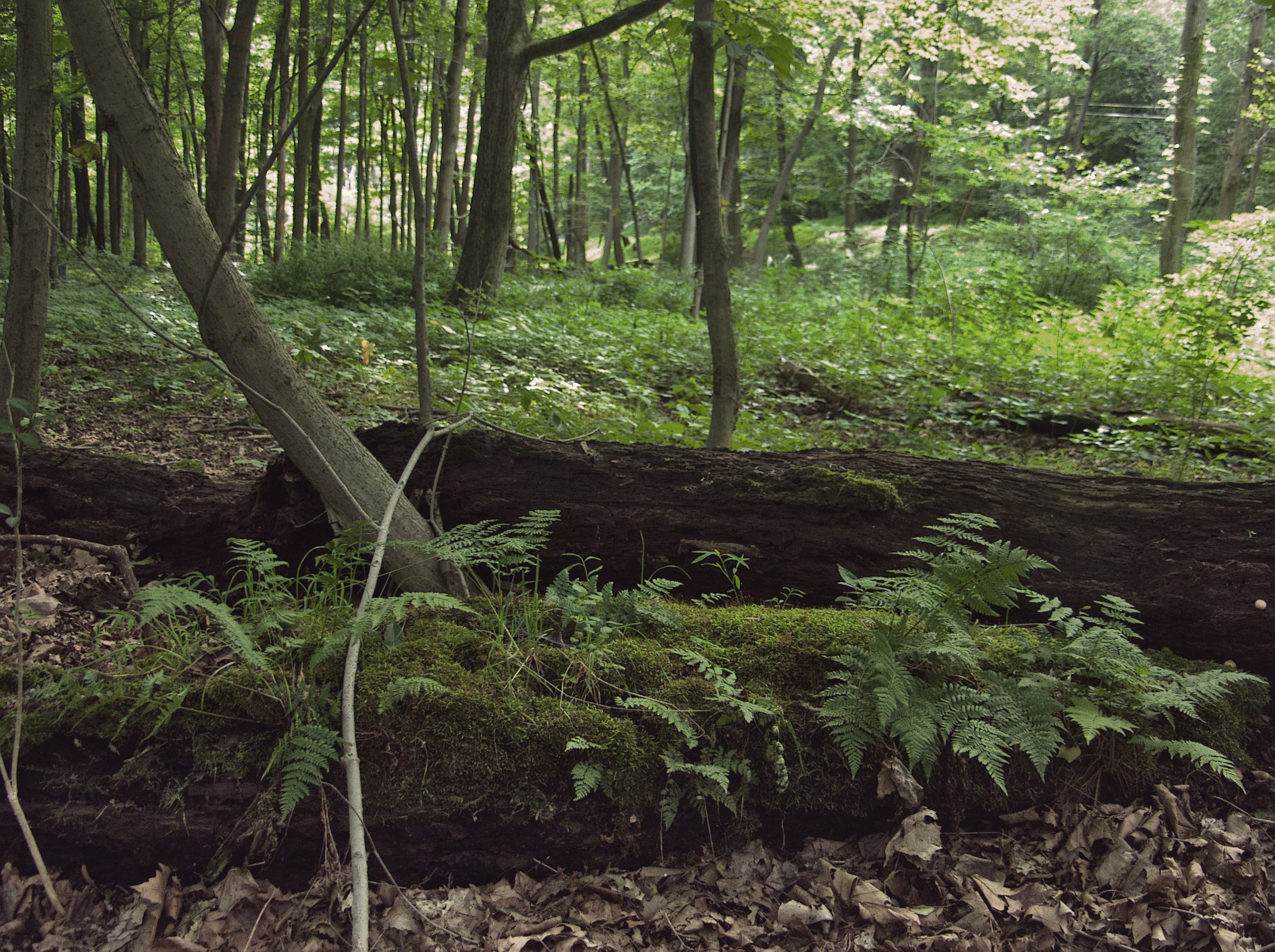
But somehow imitation two-strip Technicolor made an attractive image. In the words of Michelangelo, go figure.
0 responses to “In the Two-Color Forest”
Not understanding a single word you wrote, but then again it is from the great and powerful Oz.
It did get a bit technical, didn’t it? A less technical explanation:
The original photo was too bright toward the top and too dark toward the bottom. Darkening the top and lightening the bottom didn’t help much, as you can see. Reducing the “saturation” (the vividness of the colors) just made the picture look diseased. What did result in a good picture was using the “Technicolor 2 Color” script in the picture-editing software.
Two-color Technicolor was used in some silent and early sound movies: it recorded a limited range of reds and greenish-blues. Later color movies (like The Wizard of Oz) used three-color Technicolor, which records all the colors your eye sees. Here’s a five-minute video that explains two-color Technicolor:
[youtube https://www.youtube.com/watch?v=8iy_MjegGWY&w=560&h=315%5D
Thank you for the lesson. Now I see. So if I am being filmed and recorded on someone’s iphone (for posting on youtube) what colors should I wear or does it matter?