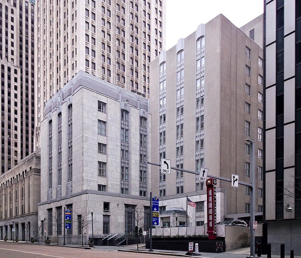
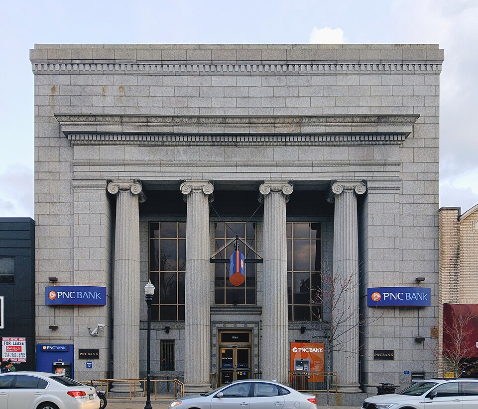
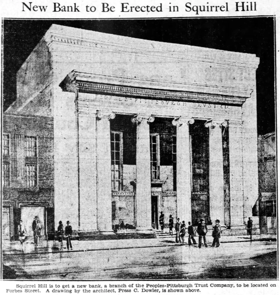
In the 1960s, Mellon Bank built a number of modernist bank branches that reinterpreted traditional bank architecture in modern forms. Here the classical colonnade is simplified to a schematic.
An Art Deco interpretation of traditional Doric bank architecture, with the added interest of an unusual shape: the lot forces the structure into a triangle. This substantial building from 1931 was abandoned for a while; then it was briefly the Iglesia de Cristo León de Judá, before that congregation took over an old church a few blocks away; then it was abandoned again. Now it is a store with the delightfully appropriate name “Candy Safe Market.” The exterior is a feast of artistic details.
The name comes from St. Clair Township, which originally included much of Allegheny County south of the Monongahela. Today the building is in the Knoxville neighborhood of Pittsburgh, right on the border with Mount Oliver borough.
This pair of griffins over the entrance ought to be guarding a clock, and perhaps they were at some point; but the bronze decoration where the clock should be is fairly old, if it is not original. The banner with the name of the store is hanging over this sculpture, which is why we have to look at it from this angle: old Pa Pitt thought it would be discourteous to take down the banner just to get a better picture.
One of the points of the triangle.
From the “form follows function” era of the middle twentieth century comes this round bank. Round is probably the most impractical and anti-functional shape you could come up with for a bank, but modernism sacrificed function for a striking effect much more often than Victorian classicism did. This was built in 1965 for Mellon Bank. It now belongs to Citizens Bank, which bought Mellon’s retail branches when Mellon merged with Bank of New York and decided not to deal with grubby working-class people anymore.
Here is another small bank that gets the architectural message exactly right, as we said a few days ago about the Carnegie National Bank. How could your money not be safe in a bank that looks like this? Imagine, too, how bright and cheerful the banking hall must have been before those tall windows along the side were filled in.
Winged chimeras guard the cartouche at the top of the great front arch.
Architecture is a kind of message that we instinctively read. When we see a bank that looks like this, we think without even articulating the thought, “That bank is stable and respectable.” The richness of the materials tells us that the bank has plenty of money; the traditional classical design tells us that it is not some fly-by-night institution that somehow swindled its way into a few bucks and will be gone as soon as its trendy design is passé. This bank on Main Street in the borough of Carnegie hits all the right notes with perfect pitch. We have forgotten how to send these architectural messages, but curiously enough we have not forgotten how to read them.
We saw the 1884 Arsenal Bank earlier from across Butler Street. Here is the 43rd Street side of the building, which we can see clearly thanks to the disappearance years ago of the neighboring buildings.
You might pass this little building by without a second glance as you walked along Poplar Street, if you ever did walk along Poplar Street (a very pleasant street) in Castle Shannon. But if you did pause, you might notice the tall Corinthian columns and sturdy-looking quoins (those patterns in the bricks that are meant to look like cut stone) and think, “I wonder whether that used to be a bank.”
Then you would look up at the pediment, and all doubt would be removed.
The electric vault alarm still sits prominently in the pediment where a richer bank might have had an allegorical figure of Commerce.
To judge by old maps, this bank was built between 1890 and 1906.
This is now the Carson City Saloon, because everything on the South Side eventually becomes a bar. But the whole building shouts “bank.” It’s built from classical elements like a Venetian Renaissance palace.
The date stone tells us that the bank was put up in 1896, with palm fronds signifying victory, and anti-pigeon spikes signifying “We hate pigeons.”
This ornamental ironwork is meant to evoke the balconies on a Renaissance palace, without actually being useful as a balcony.
Built in 1884 in a Victorian Gothic style—Father Pitt calls it Commercial Gothic—this was a bank until 1943, according to the Lawrenceville expert Jim Wudarczyk. After that it was offices for quite a while, and then was refurbished as a restaurant and apartments above. This is not a great work of architecture, but the details are interesting and worth a close look. The builder reveled in his corner location and made that corner the focus of the whole building. Old Pa Pitt can’t help thinking that the treatment of the windows could have been improved by making it either more interesting or less interesting; the stone accents are either too much or too little.