Update: This article is kept here for historical reasons, but the map here is out of date. For an up-to-date map, see Father Pitt’s latest article on Pittsburgh rapid transit.
—
Old Pa Pitt is amused. He finds endless fun in the workings of bureaucracy. The Port Authority is now operating under its new system of route names, and it’s perfectly obvious what happened.

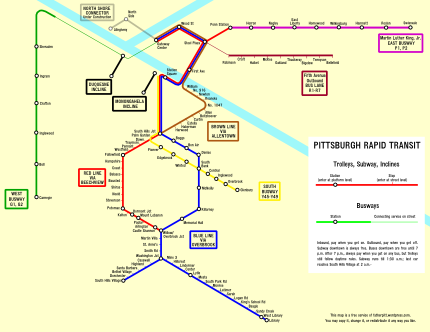
Can you spot it? Though Pa Pitt drew this map himself, he took the colors as well as the route names from the official Transit Development Plan map on the Port Authority’s site. It seems quite obvious to him that, at some point early in the revision, some genius hit on exactly the same idea that Father Pitt has been proposing for quite some time now: integrate all our forms of rapid transit (“fixed-guideway systems,” to use the language of bureaucrats) in a single system, with lines designated by colors, and you’ll have a first-rate Pittsburgh Metro.

This was the proposal old Pa Pitt had come up with. Compare it with the system we have, and note the resemblance.
Why are the routes that run on the East Busway designated by the letter P? Why do the ones on the South Busway begin with Y, and the West Busway with G? Obviously because the lines are purple, yellow, and green. But you won’t find that connection made anywhere on the Port Authority’s map.
Father Pitt would be happy to be corrected by someone who was privy to the actual decisions, but it seems obvious to him that the original proposal was just what he had suggested: include the busways in the system of colored rapid-transit lines. But somewhere along the way, some high-level bureaucrat lost his nerve. It would be too confusing to cal the Martin Luther King, Jr., East Busway the “Purple Line,” he thought. We’ll make it easier by calling it Routes P1 and P2, and we won’t mention the color purple anywhere just to keep from confusing people.
This is the way bureaucrats think, and Father Pitt would not be at all surprised to find that they had thought that way in this case.
Old Pa Pitt will admit to being a little baffled by the routes that use the Fifth Avenue bus lane in Oakland. They’re designated by R, and the line is dark red; but there’s another Red Line already. We haven’t quite run out of colors yet, you know. Orange is very popular in other urban transit systems.
The good news is that we’re halfway to common sense. The map already shows us what ought to be. Here’s a case where citizen activists can take over. We can simply start referring to the busways by their colors on the map. Call the West Busway the Green Line. It’s a green line on the map, isn’t it? Call the East Busway the Purple Line and the South Busway the Yellow Line. Sooner or later, the Port Authority will adopt what we have already made the de facto terminology.

0 responses to “The Pittsburgh Metro: Almost There”
So as not to be confused with the Red Line, I propose we call the Fifth Ave R1-R7 the Rouge Line. As an added benefit, it adds to the cultural sophistication into our mass transit system.
Or…keeping with our steel city heritage, we could name it the Rust Line. It is a rather rusty tone of red on the map. I like that they left it up to us, we can be more creative this way!
[…] a local blogger’s attempt to create a Rapid Transit map of the Port Authority system based on the new […]
[…] Martin Luther King Jr. East Busway, which in the Pittsburgh Metro scheme almost but not quite adopted by the Port Authority would be the Purple Line, is an almost […]
[…] same colored lines, obviously the remnant of some scheme, very much like Father Pitt’s “Pittsburgh Metro” idea, that was quashed by senior executives; but the lines are never named, and the reason […]